When’s The Last Time You Gave Your Website The Modern Facelift It Deserves?
“There are three responses to a piece of design – yes, no, and WOW! Wow is the one to aim for.”
As the backbone of your brand’s entire online presence, a website matters–not just a good website, but a modern, kickass website that drives sales and puts your brand on top. Every piece of content, product description, online ad, social media interaction, form of online communication–the list goes on and on–it’s all tied directly to your small business website.
Most brands have a website, some that do well driving those sales we were talking about above, and some have sites that just aren’t getting the job done. Why? The latter problem usually comes from one of two reasons. 1) The small business website was never built to drive traffic and tell that brand’s story. 2) It once was great, but after 7 years in business, it just doesn’t have the elements of a modern website or tell the right story anymore.
Here we’re speaking to those small business owners who just haven’t taken the time to give their website the facelift it needs. We get it, websites can be intimidating beasts but that’s why we’re here to help.
Performing a Website Audit
Here’s the thing, as a small business owner you kick some serious business ass. You’re busy tackling your top priorities in order to make your brand as successful as it can be. What we see many business owners often overlook is that a website is, in fact, one of those top priorities. It’s an element of your brand that must be given the proper attention in order to work the way you want it to.
On average, a business should audit their website every 1.5 to 2 years. Whether this means a complete redesign or just a facelift is dependent on what comes out of your website audit.
During an audit, you have to pay attention and look out for the following 6 things–where are you letting components of your site fall through the cracks? Does your site include all the elements of a modern website?
1. Design
Are your colors, fonts, logo, and designs on-brand with who you are right now? If your website was brought to the internet back in 2001 and hasn’t gotten attention from a web designer since then, your site is more likely than not going through a design crisis. Modern website design trends are a thing, so pay attention to them. If your site looks far from every other modern site, it probably needs a revamp.
2. Content
Take a look through the blog posts that have been published on your site over the last 5 years with a content audit. Is the content on your blog optimized? Are there old blogs with old dates and old trends? If the info your brand once published is long gone then it’s time to toss the old stuff out and strategize something new.
3. CTAs
The purpose of your site should be to draw conversions, and without proper CTAs your audience won’t know what to do. People need both hand-holding and as little steps as possible when it comes to making a purchase. Make sure that every page has an appropriate call-to-action on it and that every CTA path makes sense and sends that customer in the direction they should be headed.
4. Your Team
Check your team page, if you have one. Is it full of old employees’ faces and bios? Do you even have the same CEO that you did at the time of your website launch? If old faces are taking over your brand’s team page, it’s time to replace them with new hires. Make sure to continually check in on this as people within your brand shuffle around, and make sure to get this page straightened out.
5. Brand Story
How’s brand storytelling represented on your website? If you haven’t checked in on it for a while, it’s possible that your business is being represented online based on who you were then rather than who you are now. This is important–make sure the correct (and current) version of your brand is communicated throughout your website.
6. Backlinks
Are all links on your website working? This is a big one that we see way too often. It’s a HUGE problem and looks extremely careless if the links you’ve put on your site lead to nowhere, so make sure to check them! The internet changes every millisecond. Stay with it, and don’t let your content, information, and resources lead to nothing.
Make Your Website The Best It Can Be In 2020
As the internet continues to evolve, your website must do the same. You’ve just stepped foot into a whole new decade–what a great time to make big changes (or small ones).
Your website’s got to be a moneymaker for your brand, so give it the attention it deserves and make updates where they’re needed. Make sure you’re keeping up 2020 trends and have modernized the following elements of a good website–those components that make it the moneymaker-type.
2020 Website Design Trends
The web design world is taking off in somewhat of a different direction this decade. While websites were once perfectly clean and filled with white space, that style is no more. In 2020, we’ll be seeing many sites embrace the messy, vibrant, and eye-catching side.
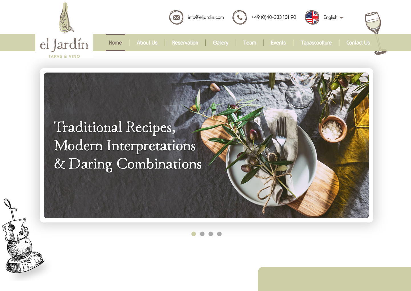
The messy trend comes from imperfections and personality. This type of modern website design allows for hand-drawn designs, appealing graphics, and tons of emotion and humanity. El Jardín Tapas & Vino’s website does a great job showing this 2020 messy trend.
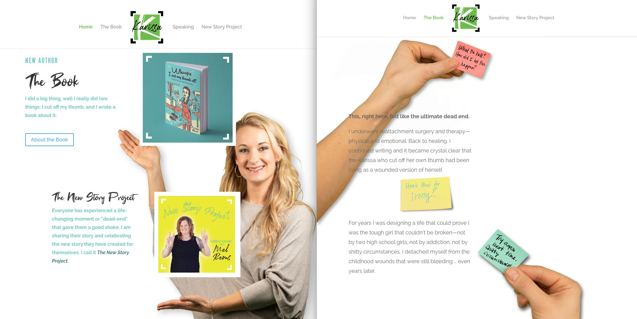
Another one of our favorite modern website design examples is the brand new Karissa Block site, featuring immersive 3D elements. This site captures the real-life elements of this brand, breaking down the wall between reality and the digital world. And it’s a real eye-catcher too, wouldn’t you agree?
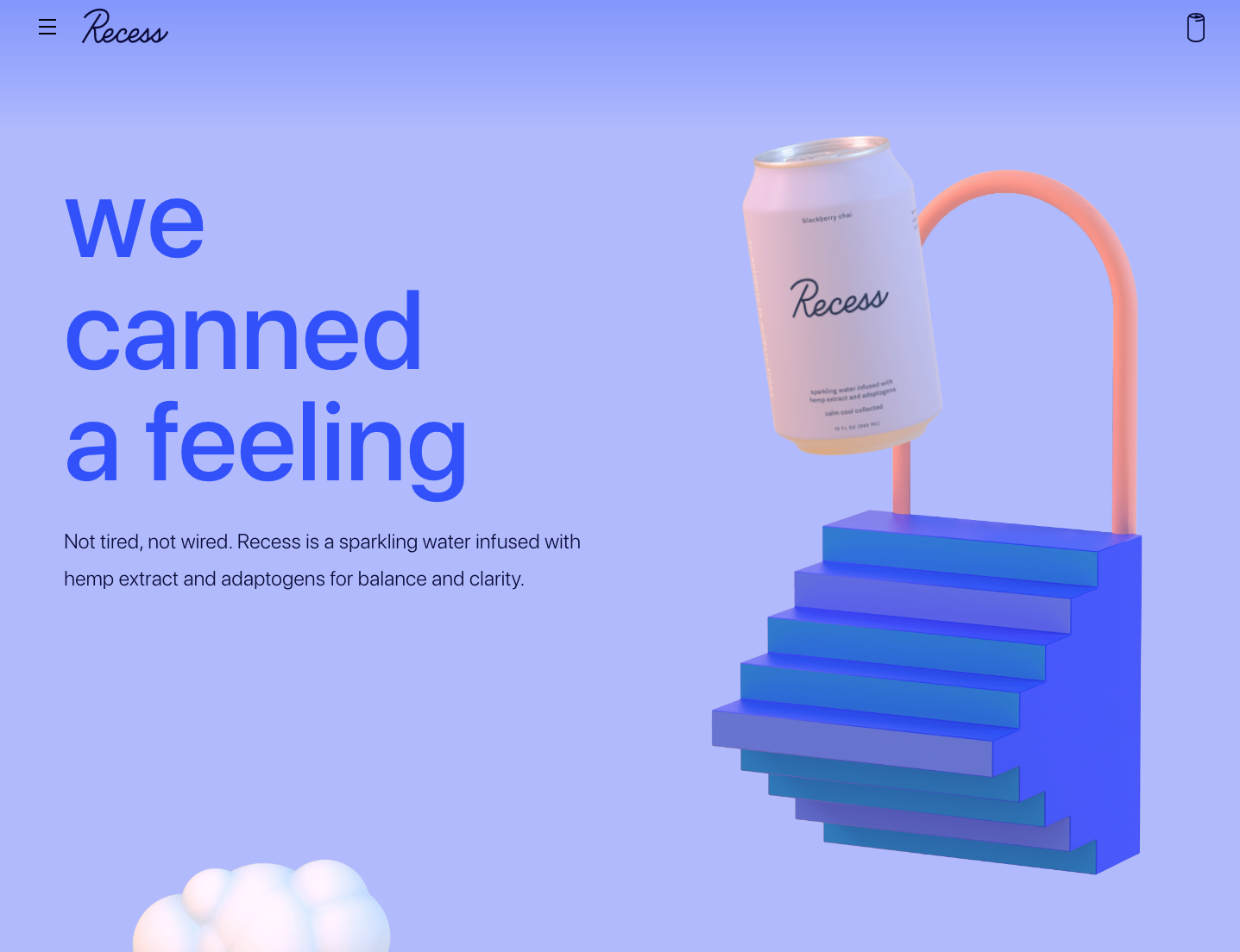
And now comes that vibrant trend we were talking about. This type of modern website layout brings together, what some might call, bold color and design choices. If you ask us, you can never go wrong with something this bright and eye-catching. Zero white space=more fun!
Something to remember when it comes to web trends and design choices: whatever you and your web designer decide on when it comes to your site revamp, make sure every design element tells your brand story. While the above three website design examples may be a hit in 2020, if none of them fit into your brand and its personality they’re not the right design choices for you. Ultimately, it’s about what your brand is all about, and there are plenty of ways to go modern with your website while still staying true to what your brand represents.
Website Copywriting Trends For 2020
Good copy–one of the most crucial elements of a modern website.
2020 is the year of conversational copywriting. Part of this has to do with the fact that chatbots and voice search have become increasingly popular. The other part of this comes from the feeling that conversational copywriting just feels that much more personal.
Instead of sounding overly professional and stone-cold, the 2020 conversational copy trend lets you and your customers relax a little and have some fun. Think of this type of writing coming from your chill friend who really wants you to buy an awesome product they know you’ll love.
See! This kind of website copywriting makes even the boring stuff fun–and it’s natural, it’s easy, it’s like real life. Make your customers forget that they’re being sold to when they visit your site and instead make them feel welcome.
And, as always, it’s a must to make sure that your web copy compliments your modern website layout nicely. If short blurbs of copy don’t make sense for the design of your site, find other ways to get the same message across in an on-brand way.
An On-Brand Presence
And last but certainly not least (probably the most important of them all, actually), your site’s gotta be you. This section probably speaks for itself, but your online presence has to always represent who you are as a brand, what you stand for, and shine with your personality.
Is your brand all about having fun and helping the community? Try showing those vibrant parts of your brand and make sure that personality is seen on every web page. If you’re a bikini community that supports the real bodies and humanness of your customers, feature those smiles, adventurers, and real-life moments all over your homepage.
Every piece–call to action, layout, color, box of copy–has to tell the story of you as a brand. Make sure your customers get the full picture when they come across your business online.
Need Website Help?
Here at Bareknuckle, we do web the right way. We check in on needed updates, write kickass copy, design every detail to be on-brand, and walk through the customer journey to make sure there is a call to action in every place you might need one. Every element of a modern website matters. Why? Because we’re strong believers that your brand story must be told everywhere your brand appears, and that includes every page of your website.
Need our help? Sit down with the Bareknuckle team for a beer and let’s see how we might be able to help.


Recent Comments