Why Your Brand Probably Needs A Website Audit … Maybe Even A Site Facelift
You know the yearly physicals you schedule with your doctor every year? Or the annual appointments with your dentist, or ever-so-dreadful yearly tax filings we’re all forced to endure. Even your car needs a check-up each year.
It’s important to check in these types of things every so often to make sure everything is in tip-top shape.
Your business works the same exact way. Taking the time to check in, or audit, pieces of your brand is essential for business success.
One thing in particular that’s worthwhile checking in on your website. Do you know the ins and outs of what’s lurking among the pages of your website? The old content that’s no longer relevant and needs some updating? Or the broken links that were not-so-broken when you first put them there?
A website audit is in your favor and will keep your digital presence on-brand, up-to-date, and working smooth.
What Is A Website Audit?
‘Audit’ can be an intimidating word. What will be found that you’re unaware of? How bad will it be? But a website audit doesn’t have to feel that way (and shouldn’t).
With more ways than ever before for Google to knock any website right out of the ballgame, a website audit is a way you can step up to the plate and make sure that’s not to happen.
A website audit consists of a full analysis of a site in order to maximize the benefits of your online presence and SEO rankings. Basically this means going through the pages, content, and everything else to check in and determine the performance of your site.
You’ll find strong points, weak points, and unnecessary elements within your website. And that’s okay. That’s what an audit is for. Once you can point out the effectiveness of your site, you can fix what’s weak, amplify what’s strong, and get rid of what’s no longer relevant.
How Often Should You Perform A Website Audit?
Like we said, it’s probably recommended to check in on your health at least once a year and your car the same. But just like these types of check ins can be different from person to person, website audits work the same way from business to business.
There isn’t a hard and fast rule when it comes to the frequency of web audits. While some find it necessary to do every single quarter, others only feel the need to conduct an audit once or twice. It all depends on the type of business and website you’re running.
Here’s a good rule of thumb. If your site isn’t your sole source of business, isn’t frequently changing, or being added to, auditing your website once a year (at minimum) should suffice. If you run an e-commerce brand, have different promotions running constantly, and are making changes to products or services often, a website audit should be performed at least every 6 months, if not every quarter.
Again, this all depends on the site you’re running and the influence your site has for the overall driving force of your business success.
The Steps To Website Auditing
Many websites are made up of dozens, even hundreds, of pages. This can feel overwhelming when it comes to shuffling through them all to perform a website audit.
If this is the case for you, start with what you feel comfortable tackling the first go-around. This could mean starting with 10 pages that drive your business, and then working on the rest in batches after those important ones have gotten your full focus.
Whether you’re starting with a few or all of your web pages, there are 5 steps to conducting a website audit. Let’s go through them.
1. Technical Audit
The technical component of any website is by far the most important. If your site isn’t running cleanly and efficiently, how will visitors navigate through it? The underlying technology affects every other aspect of your site.
Ask yourself these questions:
- Are logins, contact forms, and social media integrations working right?
- Do you perform regular site backups? Can you restore your site if it becomes needed?
- Have updated all plugins on your site?
- Do you have the best security practices implemented?
2. SEO Audit
SEO plays a huge part in driving visitors to your site and making it visible to a wider audience. Auditing your site factors that can be making or breaking your Google ranking is all about what’s on and behind each of your pages.
Ask yourself these questions:
- Does each of your pages have keyword-optimized headings and metadescriptions?
- Do all on-page links work correctly?
- Is there a tracking tool on your site to track what’s going on among your site: frequently visited topics, entrance pages, exit pages?
- Are your images optimized with keywords and alt texts?
3. Content Audit
Do you remember that blog post or web page you wrote 5 years ago? Is it still relevant? And is it optimized? Auditing the content on your site is a step that’s necessary when it comes to maintaining an efficient and trustworthy site.
Ask yourself these questions:
- Is all of your content up-to-date, helpful, useful, clear, relevant, and rich in clustered keywords?
- Is the copy engaging and inviting?
- Are 300 word content pages being flattened by 1,500+ word pages?
- Has old content been updated with newer internal, relevant links?
4. Lead Generation Audit
Getting leads from your website is the goal, right? We all want visitors to be impressed with our site and our services or products and take the next step in doing business with us. Leads and conversions are generated from quick, clear, engaging calls to action (CTAs) among (almost) every page of your site. A visitor should never find themselves at a dead end with nowhere to go but the X button.
Ask yourself these questions:
- Does every page lead to something else (a button to read more on another page, a CTA button, a link to contact)?
- All all CTAs clear and easy to find?
- Is someone drops off of a page or leaves a CTA unfinished, do you give them the opportunity to do something else (email subscription pop-up, exit intent promotional code)?
- Are any pages overwhelmed with too many CTAs?
5. User Experience Audit
We all love ease when it comes to being a consumer—whether than means an easy purchase, a clearly explained infographic, or a website that we can breeze through. The way a user feel when experiencing your site should be simple and satisfying. If not, there’s a higher likelihood they’ll become frustrated and drop off.
Ask yourself these questions:
- Does every page load in less than 3 seconds?
- Is the navigation easy to use and clearly visible at all times?
- Are there minimal (or no) advertising sections? Do they block content viewing?
- Is your site mobile-friendly?
A Website Audit Case Study
Resolute Capital Partners is a group of real estate, gas, and alternative investment experts who dedicate their work to unveiling investments, offering tangible opportunities in the U.S. as well as alternative investment options like cybersecurity. We dig their ingenuity in an industry of established yet confusing approaches, and we were eager to help them rise to the top with a kick-butt website and brand.
The Challenge
While the people behind Resolute Capital are experienced professionals with diverse expertise, this ambitious company is a relatively new player, still growing its processes and personnel. Its perceived “new kid on the block” reputation could mislead investors to be wary, as anything new holds potentially more risk.
It was crucial for Resolute to have an online presence that illustrated their seat at the table while also setting them apart from big bad Wall Street. Resolute needed to look, sound, and feel different. After all, when it comes to your money, different is a terrifying concept.
But the experts at Resolute Capital understand how the opaque methods of Wall Street limit opportunity, and it wants to help investors benefit from a more transparent, tangible approach. It just needed a platform to get the ball rolling in the right direction.
The Homepage
Standing out from the crowd came first on the list. We wanted site visitors to understand how Resolute operated by different values—an approach to investing that you, the site visitor, could get behind.

Sending The Message Of Transparency & Tangible Investment
As the visitor lands on the site, she is greeted by the statement, “Resolute Capital: Beyond Wall Street Assets For Smart Investors.” The statement is illustrated with an approach comparison that captures the “What We Do” and “What We Don’t Do” in a clean, accessible form.
Below the graphic is a quantitative illustration of the company’s credibility. On the homepage, capturing the qualitative and quantitative assets (hitting data and pain points) creates a well-rounded appeal to the vast and diverse population looking to invest.
One item that remains constant through the homepage is the phrase, “smart investors.” A goal of the brand’s messaging was to re-acquaint investors with the idea that they are ultimately in charge of their money, not subject to any unclear, potentially misleading investment methods.

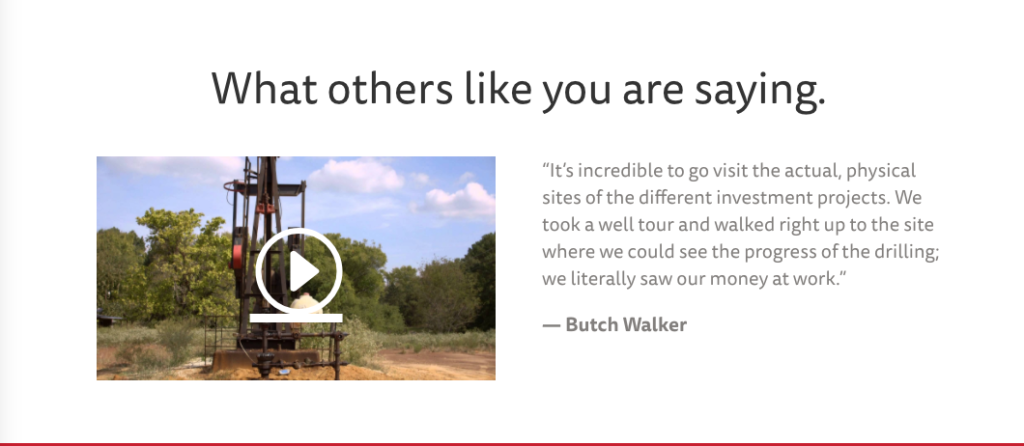
The graphic is followed by a video and testimonial about site visits. With Resolute, investors are able to visit the site they are investing or looking to invest in.

The ‘How It Works’ Page
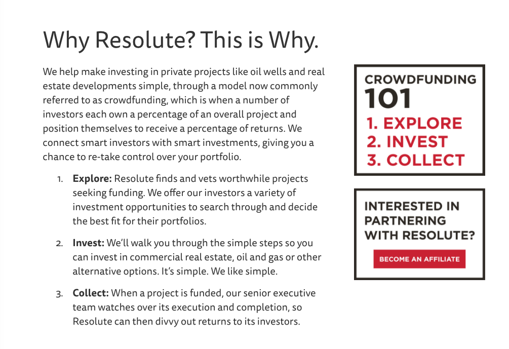
Because crowdfund investing is a relatively new approach to the world of investments, Resolute’s site needed a simple lay-of-the-land explanation, considering most people are trained to trust traditional methods via Wall Street.

Information in bulk can appear bland and overwhelming. We wanted to create an inviting platform for Resolute’s investment resources.

Working with the Resolute Capital team has been equally as rewarding as it has been creatively challenging. This company is onto something big. We had a blast kicking around ideas and building a brand that really expressed what these people are about. Thanks for partnering with us, Resolute Capital!
Ready to talk about your brand—whether it’s website audits, growth, or getting your thing on its feet? It can all start with a conversation. Grab a beer with us, and let’s get down to it.


Recent Comments